Dealing with massive datasets isn’t always a walk in the park. Sometimes, the sheer size of the data makes it incredibly challenging to extract any meaningful insights. This is why having the best data visualization tools helps.
However, crafting effective data visualizations isn’t always a simple task. It’s not like designers can just take a dataset with thousands of entries and effortlessly create a visualization from scratch. Sure, it’s technically doable, but who wants to spend countless hours manually plotting points on a scatter chart? This is precisely where data visualization tools come into play.
What is Data Visualization?
Data visualization is the graphical representation of data to communicate information clearly and efficiently. Through visual elements such as charts, graphs, and maps, data visualization allows users to understand complex datasets, patterns, and trends at a glance. It enables the presentation of large amounts of data in a visually appealing and accessible format, making it easier for decision-makers to interpret and derive insights from the information presented. Data visualization tools are widely used across various fields, including business, science, engineering, and journalism, to convey data-driven insights and support decision-making processes.
The data visualization market is projected to reach significant milestones in the coming years. As of 2024, its estimated size stands at USD 9.84 billion. By 2029, experts anticipate this figure to soar to USD 16.54 billion, reflecting a substantial growth trajectory in the market.
What Do the Best Data Visualization Tools Have in Common?
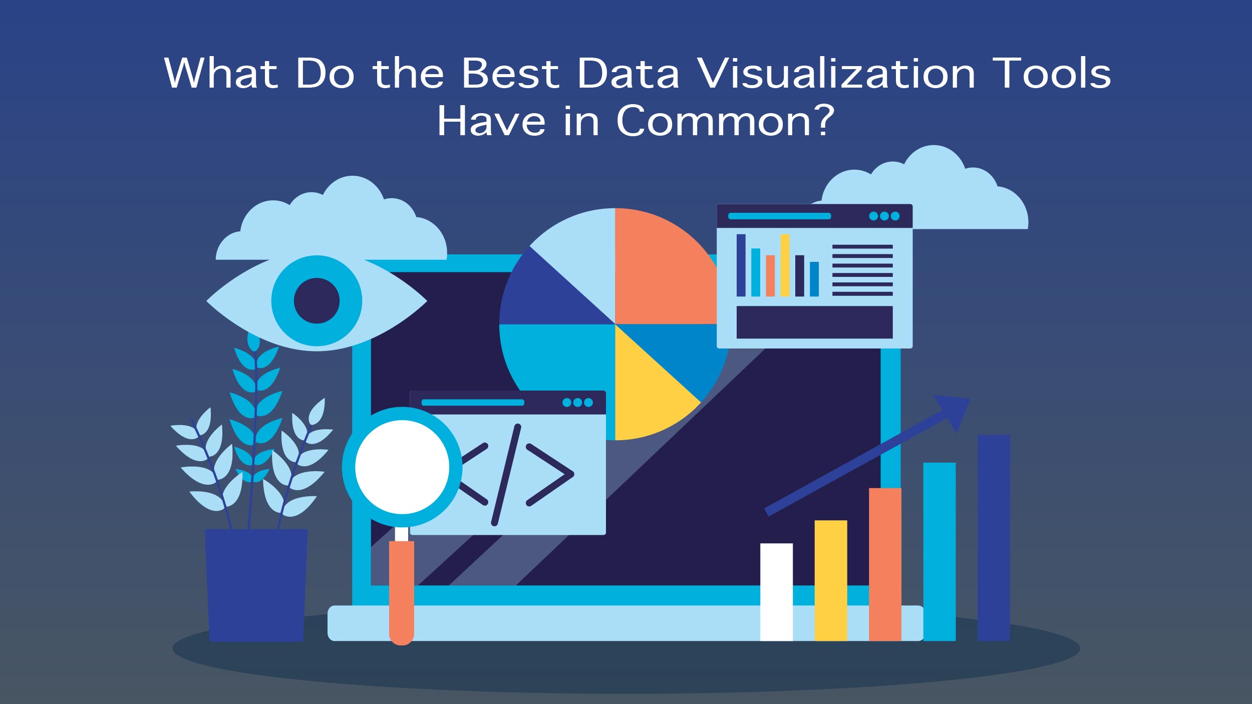 The top-tier data visualization tools share several key characteristics that set them apart.
- Ease of use: While there are complex data visualization tools available, the best ones boast intuitive interfaces, supported by comprehensive documentation and tutorials. Tools lacking in user-friendliness are often excluded from lists of the “best” tools, regardless of their other capabilities.
- Handle vast datasets: The finest among them can effortlessly manage multiple datasets within a single visualization.
- Versatility: The best ones offer a wide range of chart, graph, and map types, catering to diverse visualization needs. Most of these tools provide options for both static images and interactive graphs. However, some specialize in specific chart or map types, excelling in those areas while still earning recognition as top-tier tools.
- Cost: While a higher price tag doesn’t necessarily indicate superior quality, it should be justified by enhanced support, features, and overall value. The best tools strike a balance between cost and benefits, offering users a worthwhile investment.
Also Read: Endpoint Security: What is it, How Does it Work and Why is It Important?
5 Best Data Visualization Tools to Use in 2024
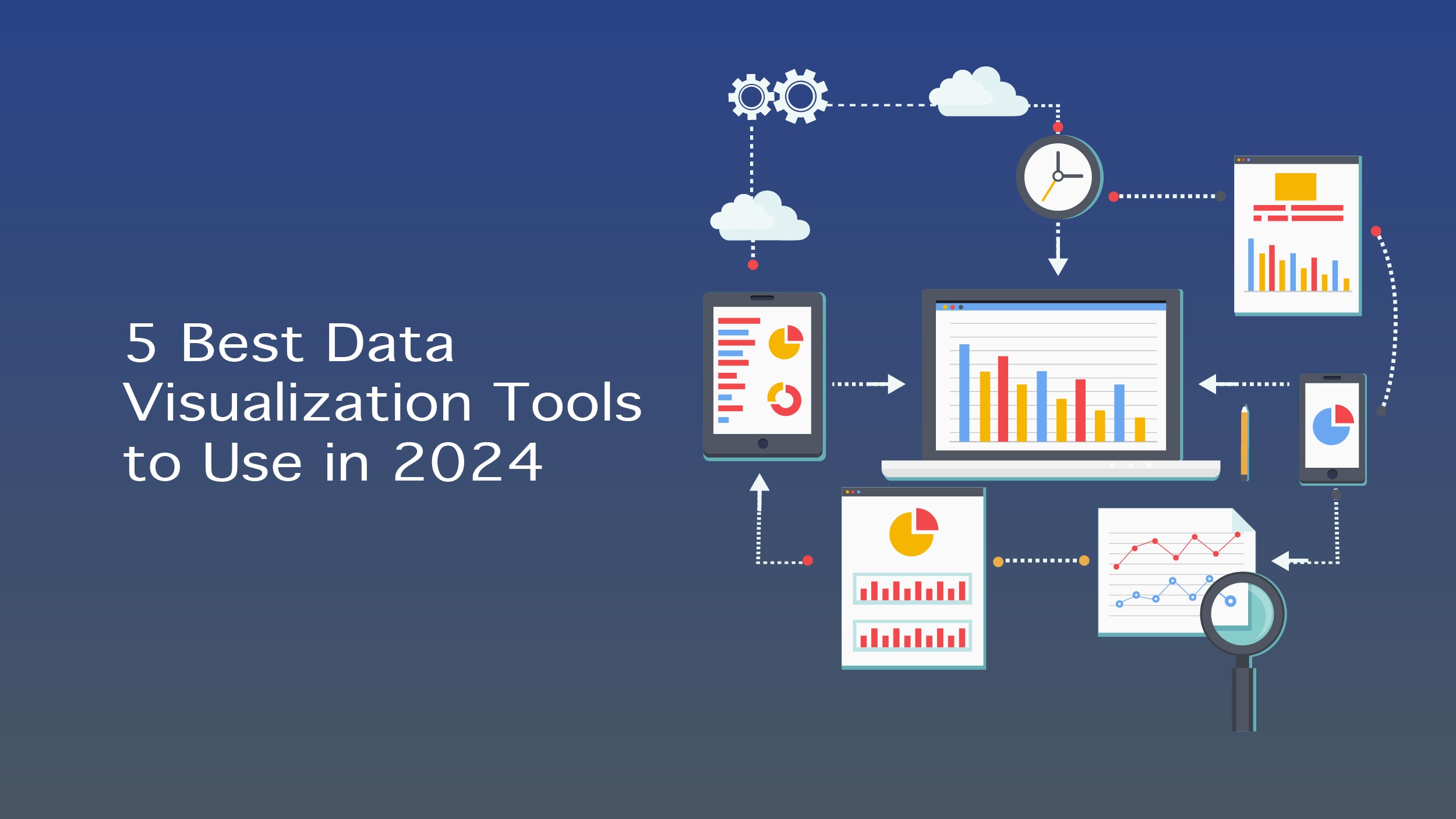 Below are the top five data visualization tools every business analyst should know about.
Infogram
Infogram stands out as a fully-featured drag-and-drop visualization tool catering to a broad user base, including both designers and non-designers. Its versatility enables the creation of diverse visualizations, ranging from marketing reports and infographics to social media posts, maps, and dashboards.
Export Formats: Users can export visualizations in multiple formats, including PNG, JPG, GIF, PDF, and HTML, offering flexibility in sharing and presentation. Moreover, Infogram supports interactive features, allowing users to embed dynamic visualizations into websites or apps effortlessly. Additionally, the availability of a WordPress plugin streamlines the embedding process for WordPress users.
Pros:
- Tiered pricing structure, including a free plan with basic features, accommodating different user needs and budgets.
- Possess extensive library comprising 35+ chart types and 550+ map types, ensuring versatility in visualization creation.
- Intuitive drag-and-drop editor, facilitating ease of use for users across skill levels.API integration for importing additional data sources enhances data accessibility and integration capabilities.
Cons: limited built-in data sources compared to some competitors, potentially requiring manual data input for certain datasets.
ChartBlocks
ChartBlocks emphasizes its API capabilities, boasting seamless data import from a wide array of sources, including live feeds. The platform offers extensive customization options, empowering users to tailor visualizations to their specific needs.
Data Import: ChartBlocks streamlines the data import process through an intuitive wizard, enabling users to select and import data effortlessly.
Pros:
- Offers both free and reasonably priced paid plans, catering to users with varying needs and budgets.
- A user-friendly data import wizard simplifies the process of importing necessary data for visualization creation.
- Responsive output ensures compatibility across different devices, enhancing the user experience.
Cons:
- The robustness of the API is unclear, potentially posing challenges for advanced data integration needs.
- Mapping capability is not apparent, limiting the scope of visualization possibilities.
Datawrapper
Datawrapper targets newsrooms, providing a specialized platform for adding interactive charts and maps to news stories. While its data sources are limited, the platform offers straightforward chart creation with a focus on ease of use.
Visualization Types: Datawrapper supports various visualization types tailored for news website embedding, ensuring compatibility with editorial workflows.
Pros:
- Designed specifically for newsroom data visualization, catering to the unique requirements of journalistic storytelling.
- The availability of a free plan makes it accessible for smaller sites with limited resources.
- Built-in color blindness checker enhances the accessibility and inclusivity of visualizations.
Cons:
- Limited data sources may restrict data import options, potentially requiring manual data input for certain datasets.
- The cost of paid plans, starting at $39 per month, may be prohibitive for some users or organizations.
D3.js
D3.js stands as a powerful JavaScript library for manipulating documents using data, offering unparalleled flexibility and customization options. While it requires programming knowledge, there are tools available for non-programmers to leverage its capabilities.
Features:
- Highly customizable with a vast array of chart types, providing extensive flexibility in visualization creation.
- Emphasis on web standards ensures compatibility and interoperability across different platforms and browsers.
- Free and open-source nature fosters community collaboration and innovation, contributing to its widespread adoption.
Pros:
- Empowers users with unparalleled control over visualization design and functionality, catering to advanced data visualization needs.
- Tools available for non-programmers enable broader accessibility and utilization of D3.js capabilities.
- Open-source nature fosters community-driven support and development, ensuring continuous improvement and innovation.
Cons:
- Requires programming knowledge to utilize its full potential, potentially posing challenges for users with limited coding skills.
- Limited support compared to paid tools may require users to rely on community resources for assistance and troubleshooting.
FusionCharts
FusionCharts offers a comprehensive JavaScript-based solution for creating web and mobile dashboards, boasting an extensive library of chart and map types. It integrates seamlessly with popular JS frameworks and server-side programming languages, enhancing its versatility and compatibility.
Features:
- Wide range of chart and map options, providing users with diverse visualization choices to suit various data presentation needs.
- Integration with multiple frameworks and languages facilitates seamless embedding and integration into existing web and mobile applications.
- Ready-to-use code snippets simplify the embedding process, enabling users to incorporate visualizations with ease.
Pros:
- Extensive chart and map format options cater to diverse visualization needs, ensuring flexibility in presentation and data storytelling.
- Seamless integration with various frameworks and languages enhances compatibility and interoperability with existing development environments.
- Ready-to-use code snippets streamline the embedding process, minimizing development effort and time.
Cons:
- The higher starting price may deter users with limited budgets or simpler visualization needs.
- May be perceived as overkill for straightforward visualizations outside of a dashboard environment, potentially leading to unnecessary complexity for certain use cases.
Takeaway
Data visualization tools are invaluable assets for organizations seeking to derive insights and communicate complex information effectively. These tools offer visually appealing and interactive representations of data, enabling users to easily understand patterns, trends, and relationships. With the ability to create charts, graphs, maps, and dashboards, data visualization tools enhance decision-making, facilitate data-driven storytelling, and promote better understanding across teams and stakeholders.