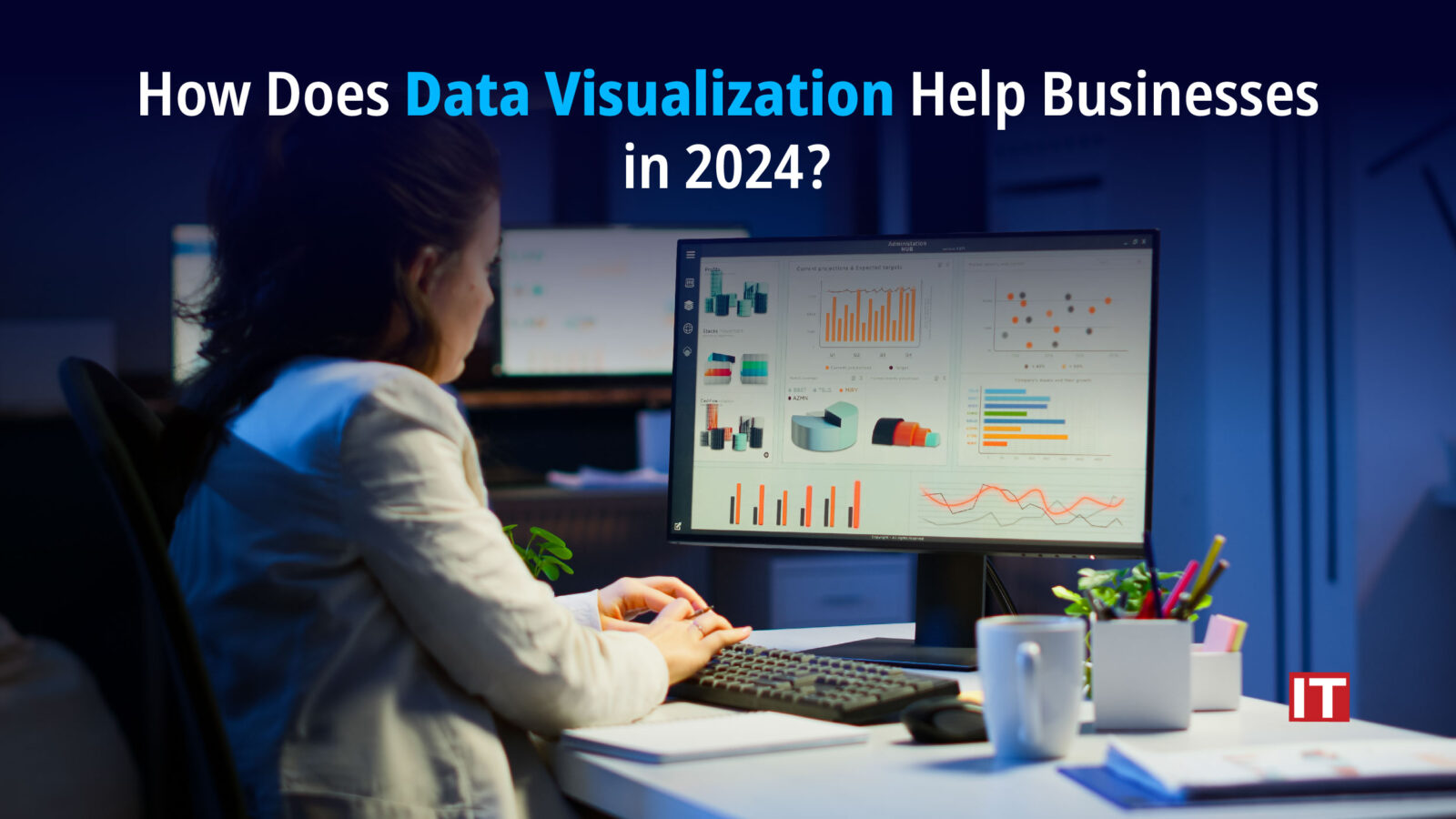
In this busy world, time is super valuable, and having the correct information at the right moment can make all the difference. Decision-makers across industries require a quick understanding of complicated facts that would ultimately affect their company. There is an increasing need to interpret information correctly and quickly.
This is where data visualization, or dataviz, comes in. This technology enables analysts to monitor critical metrics, generate forecasts, and transform data into attractive and interactive charts to improve other processes.
What Is Data Visualization?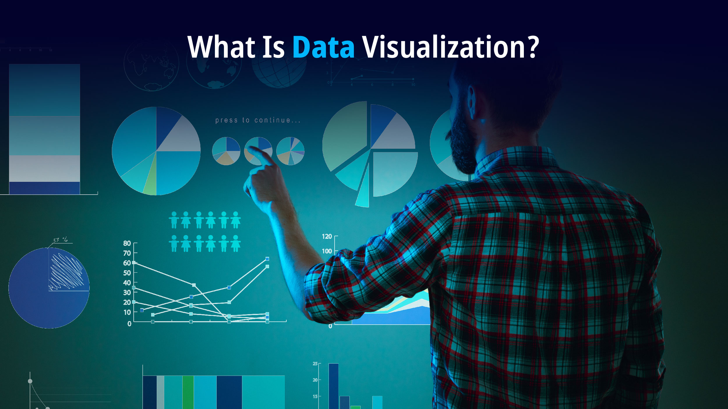
The process of displaying information and data as graphic components, charts, graphs, maps, etc. is called data visualization. Visualizing the data makes it easier for users to identify trends, making them more accessible, as well as easier to manipulate in the future.
Data Visualization Types
- Bar charts are the most popular form of chart. You can use it to compare categories or show changes over time, with bars for the data.
- Line charts mainly show trends and changes over time. It is great for spotting patterns and relationships when working with continuous data.
- Pie charts are circular graphs that display data as slices of a pie. Perfect for showing percentages and proportions as a whole.
- A scatter plot helps illustrate the relationship between two variables. Plot data points on a graph, one variable on the x-axis and the other on the y-axis, to see correlations or clusters.
- Heat Maps: Use colors to display data values on a grid or map. Great for highlighting trends and differences in large data sets, especially spatial or geographic.
- Tree maps present data in a hierarchy. It is good for showing links and proportions within a hierarchy.
- Network diagrams connect elements using nodes and edges. Common in social network analysis, supply chain analysis, and other fields where entity relationships matter.
- Histograms display continuous data. Group the data into bins and show how many data points fall into each bin to see the frequency or count in each range.
- Bubble charts use differently-sized bubbles to represent data points.
- Choropleth maps make use of colors or patterns to represent data values for different geographic regions.
Also Read: 10 Best Open-Source Big Data Tools for Professionals
What is the benefit of Data Visualization to Businesses?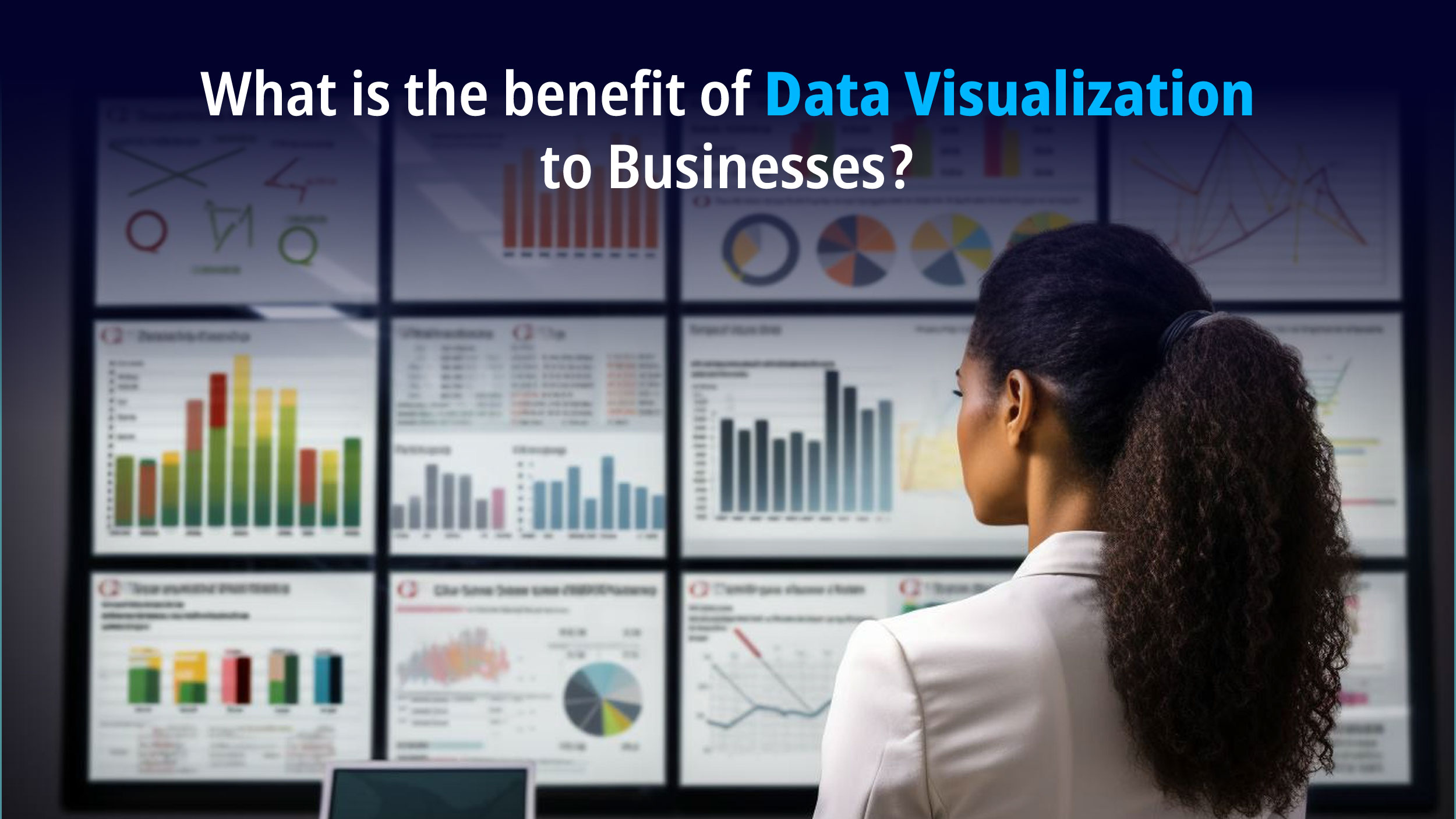
- Making Better Decisions: Data visualization tools help you to accurately spot patterns in complex data and get meaningful insights. When you display data visually, it becomes a breeze to identify patterns, outliers, and correlations.
- Understanding Data: Picture this: by employing data visualization, businesses can actually make sense of their massive amounts of data. It’s like putting on a pair of glasses that magically reveal errors, emerging trends, and problem areas. Dataviz helps you simplify and visualize complex information, making it a piece of cake to find areas for improvement and get a better grasp of what’s going on.
- Quick and Precise Understanding: Dataviz facilitates the rapid assimilation of information and the extraction of insights. Everyone in a company can comprehend and evaluate information more quickly, make decisions, and solve problems more quickly when data is presented visually.
- Possibilities and Warning Signs: Data visualization assists companies in identifying possibilities for development and improvement. Stakeholders can concentrate on issues that require attention and increase the productivity and profitability of the company by examining reports and visual data. Finding red flags or regions to gauge development is also helpful.
Examples Of Data Visualization
Historical Dataviz: There are a ton of amazing historical data visualizations. These include maps that lead you through the history of cartography, animations that depict the magnitude and consequences of nuclear explosions, and script analysis and historical conquest visualizations.
Modern Dataviz: Amazing visualizations have been created in the previous several years by creators. Interactive visualizations that depict electricity availability globally, COVID-19’s effect on poverty rates, and information visualizations that translate complex data into visuals are a few examples.
Business Dashboards: Dataviz is used in business to show real-time data, charts, and graphs. Tools like Microsoft Power BI, Infogram, etc. let you create custom dashboards to make informed business decisions. These dashboards can show information like worldwide access to electricity, sales performance, and customer behavior.
Geographic Dataviz: Geographic dataviz is mapping data onto geographical regions. Examples include visualizations that employ location-specific data to study patterns and trends and choropleth maps that display election results or demographic data.
Hierarchical Dataviz: Data with a hierarchical structure can be represented using hierarchical dataviz. For instance, treemaps can display a major company’s hierarchical organizational structure.
Winding Up
In short, data visualization is a must-have in this data age. It helps professionals make decisions quickly and smartly by converting complex data into clear insights. Whether through interactive dashboards or simple charts, visualization helps you understand, gets you better outcomes, and keeps up with the growing demand for data literacy.